ONE GARDENER TO ANOTHER: Coloring in the garden
Published 6:45 am Monday, February 19, 2018

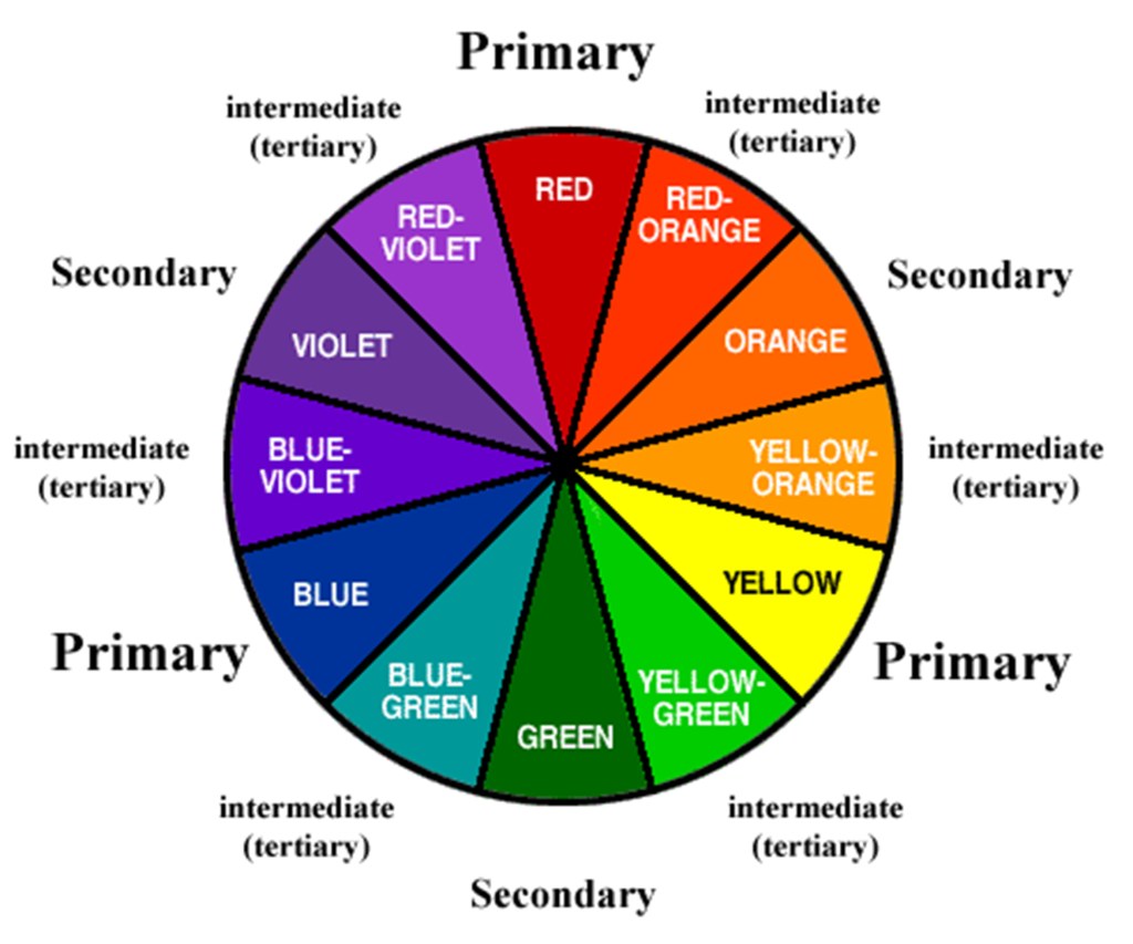
- This color wheel is distributed by the Limestone County Master Gardeners.
I have always loved to color. A brand-new box of crayons, especially the big 64-pack with the built-in sharpener, brought me great joy.
My mom used to roll up a coloring book, wrap it like a party popper with ribbon securing either end and attach it to the top of a present or stuff it into my Christmas stocking. On my birthday a couple of years back, my mother-in-law gifted me a grown-up coloring book and pencils. Best present ever.
Trending
My sister-in-law colors, too. I have seen some of the pages she has done. I have to admit, she has a great eye for color. Her pictures seem to have a nice flow to them. I start off putting one color in, then I get bored with that color and start with another. Now there is too much of those two colors, so I pull out another, and another and another.
Although I like to color and I stay in the lines, I jumble up my colors to the point that it looks disconnected. The same thing can happen when planting in the garden.
One of the best handouts that I received going through the Master Gardener course was the color wheel. It is broken down into three groups of colors. The primary colors — red, yellow and blue — are colors that can’t be made by mixing colors. The secondary colors — orange, green and violet — are made by mixing two primary colors, i.e. yellow + blue = green. Finally, the tertiary colors, such as blue-green and red-orange, are between the primary and secondary colors, and there’s an infinite spectrum of colors between those.
The wheel is then split in half. The warm side consists of red, orange and yellow. The cool side is made up of blue, green and violet. The warm colors are attention-grabbers and appear to come forward in the landscape. They make large spaces seem smaller and draw attention away from eyesores. The eye will naturally go to a bank of bright red begonias and away from the shed on the other side of the driveway, for instance.
Warm colors are festive. They can be planted near patios or draw attention in the garden toward sitting areas or entrance ways.
The cool side is more calming. They seem to be further away in the landscape and make small spaces seem larger. They can be used to create a serene atmosphere. A pretty white bench surrounded by a sea of blue is an inviting place to sit and take a deep breath.
Trending
Cool colors can be paired with intense warm colors to “cool” them down. Within each color, whether warm or cool, there is a range of warmness and coolness to them. A red-violet is cooler than its red parent and warmer than its violet side.
Complimentary colors are found directly opposite on the color wheel. Yellow compliments violet, red compliments green, blue compliments orange. When used together, complimentary plants increase the vibrancy of both. Try planting salvia or blue poppies with easy to grow marigolds or orange Gerber daisies.
Analogous colors, simply put, similar colors, are another method of planting. This method employs using three colors found next to each other on the color wheel. Use one color as the dominant color, the second to compliment and the third to accent. For instance, violet, red-violet, and a lighter tint of red.
A triad color scheme is another popular way of planting. This brings seemingly unrelated colors together to add uniqueness and display creativity.
Triad colors are found an equal distance from each other on the color wheel. For instance, yellow, red and blue, or green, orange-red and violet.
These color schemes are used not only by gardeners but by designers and painters alike. Until next week, happy coloring.
— Irland, a member of the Limestone County Master Gardeners, can be reached at kippirland@hotmail.com. For more information on the Limestone County Master Gardeners, visit http://mg.aces.edu/limestone.


